
You're staring at a spreadsheet with 2,000 rows of assessment data. Column headers like "discrimination index" and "point-biserial correlation" might as well be written in ancient Greek. Your certification exam just wrapped up, 40% of test-takers failed question 17, and leadership wants answers by Monday.
This scenario plays out constantly across training departments and certification bodies. The assessment platform spits out numbers, everyone nods during meetings, but nobody knows if question 17 is actually broken or if candidates genuinely struggle with that concept.
Most item-level analysis gets ignored because the reports look like they need a statistics PhD to interpret. Bad questions keep cycling through your assessment library, slowly undermining your program's credibility.
The real cost of ignoring item-level data
A pharmaceutical company discovered their compliance certification had a 92% pass rate—sounds great, right? Digging into individual questions revealed 8 items that literally everyone got correct. These weren't measuring knowledge; they were participation trophies inflating scores.
Another pattern emerged: their "advanced" questions showed negative discrimination values. Stronger candidates were getting these wrong while weaker ones guessed correctly. The assessment was measuring test-taking luck rather than actual competency.
Without proper item-level analysis, assessments become expensive random number generators. You're certifying people who shouldn't pass while failing competent professionals who just hit poorly written questions.
Building your triage system without the statistics degree
Start with difficulty index—your most actionable metric
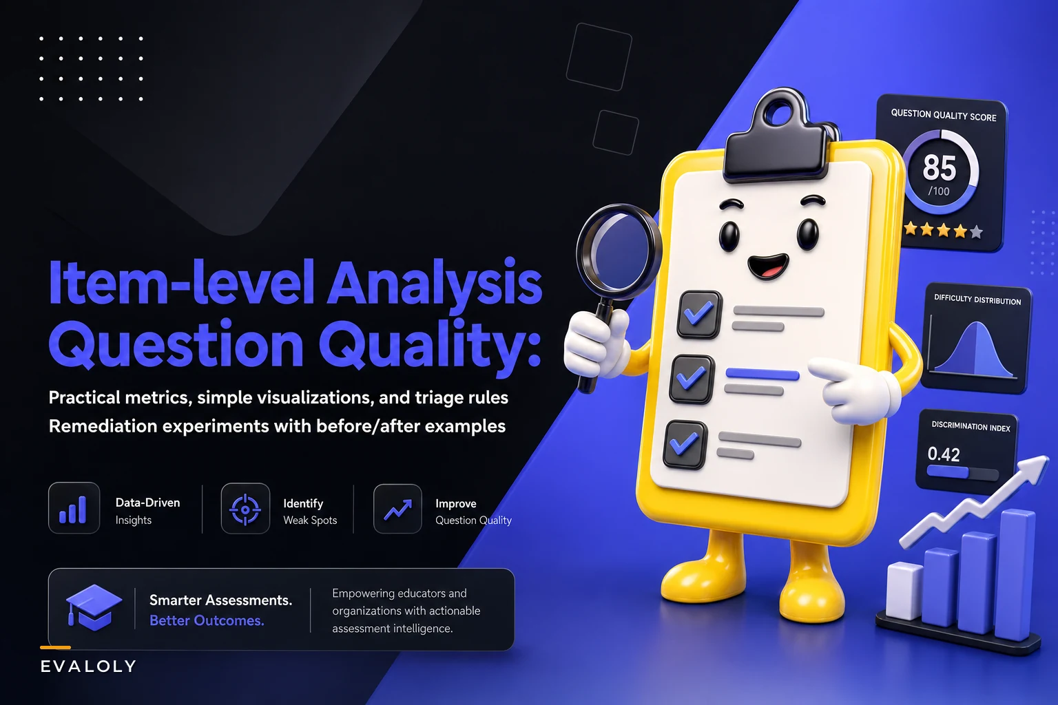
Eliminate assessment bottlenecks.
Evaloly simplifies every step from test design to results analysis, making assessments faster and more reliable.
- Customizable test creation
- Automated grading and analytics
- Secure distribution and proctoring
No credit card required
Difficulty index tells you what percentage of people got a question right. Calculate it by dividing correct responses by total attempts. A question answered correctly by 20 out of 100 people has a difficulty index of 0.20 or 20%.
The triage framework that actually works:
Red flags (immediate action):
-
Below 30% correct
Too hard or confusingly written
-
Above 90% correct
Too easy or the answer is obvious
-
Exactly 25% or 50% correct on multiple choice
People are guessing
Yellow flags (monitor closely):
-
30-40% correct
Challenging but potentially valid
-
80-90% correct
Easy but might serve a purpose
-
Sudden difficulty changes between cohorts
Green zone (keep as-is):
-
40-80% correct with stable performance across groups
-
Questions that align with learning objectives importance
A medical device training program discovered their "critical safety" questions averaged 95% correct while "operational procedures" sat at 35%. They were passing everyone on safety (where stakes are highest) while failing them on less critical content.
Discrimination index reveals which questions actually work
Discrimination index shows whether high-performers do better on a question than low-performers. You want questions that separate those who know the material from those who don't.
Simple calculation method:
-
Split test-takers into top 27% and bottom 27% by total score
-
Calculate the percentage correct for each group
-
Subtract bottom group percentage from top group percentage
Interpretation guide:
-
Above 0.40
Excellent question, keep it
-
0.30-0.39
Good question, minor tweaks might help
-
0.20-0.29
Marginal, needs review
-
Below 0.20
Problem question, likely confusing or off-topic
-
Negative values
Emergency—strong performers doing worse than weak ones
An IT certification program found their scenario-based questions had negative discrimination. Experienced professionals were overthinking nuanced real-world considerations while novices picked the textbook answer. The questions needed rewriting to clarify scope.
Response pattern analysis catches the hidden problems
Look at how people distribute across answer choices. This reveals issues that other metrics miss.
Patterns that demand attention:
-
Nobody picks option C
Dead giveaway that it's obviously wrong. Replace it with something plausible.
-
Everyone who gets it wrong picks the same incorrect option
Your distractor is too attractive or contains partial truth. This confuses rather than assesses.
-
Equal distribution across wrong answers
Pure guessing. The question itself is probably incomprehensible.
-
The correct answer is always the longest option
Test-wise candidates will exploit this pattern even without subject knowledge.
The correct answer is always the longest option: Test-wise candidates will exploit this pattern even without subject knowledge.
Creating simple visualizations non-statisticians actually understand
The performance grid everyone can interpret
Create a 2x2 grid plotting difficulty (x-axis) against discrimination (y-axis):
| Discrimination/Difficulty | Low Difficulty (<40%) | High Difficulty (>40%) |
|---|---|---|
| High Discrimination (>0.30) | Good challenging items | Ideal questions |
| Low Discrimination (<0.30) | Too hard AND confusing | Too easy or broken |
Plot each question as a dot. Problems cluster in the bottom corners while quality items migrate toward the top-right "ideal" zone. A corporate compliance team reduced their question bank by 30% just by removing items stuck in the "too hard and confusing" quadrant for three assessment cycles.
Time-spent heatmaps reveal different problems
Quick and wrong: Misunderstood questions or trick wording Quick and right: Good recall questions or too obvious Slow and wrong: Concepts need better teaching or question needs clarity Slow and right: Appropriately challenging or overly complex wording
One nursing program found students spending 8 minutes on a drug dosage calculation that should take 2 minutes. The question wasn't testing math skills—it was testing ability to parse a confusing scenario description.
Score distribution curves expose assessment design issues
Normal bell curve: Assessment working as designed Left skew (most scores low): Too difficult or poor instruction Right skew (most scores high): Too easy or teaching to the test Bimodal (two peaks): Two distinct populations or major concept gap Flat distribution: Random performance, assessment not measuring anything consistent
The remediation experiments that actually move metrics
Before: Manufacturing safety certification with 62% first-attempt pass rate
Initial analysis revealed:
-
5 questions with discrimination below 0.20
-
12 questions where 70%+ chose the same wrong answer
-
Average completion time
94 minutes for 50 questions
Root causes identified:
-
Double negatives in stem text ("Which is NOT an unsafe practice?")
-
Outdated terminology from old equipment manuals
-
Distractors containing technically correct edge cases
After: Targeted question revision based on item analysis
Changes implemented:
-
Rewrote negative questions as positive statements
-
Updated terminology to match current equipment
-
Replaced edge-case distractors with common misconceptions
Results after 3 months:
-
Pass rate increased to 74%
-
Average discrimination improved from 0.31 to 0.42
-
Completion time dropped to 71 minutes
-
Zero complaints about confusing wording (down from 15-20 per session)
The improvement came entirely from fixing problematic questions identified through item-level analysis—no changes to training content or delivery.
Response option surgery that improved discrimination 40%
A project management certification had questions where incorrect options were obviously wrong ("Run away screaming from the project sponsor" mixed with realistic choices). We ran an experiment:
Control group: Original questions with obvious throw-away options Test group: Revised questions where all options represented actual approaches students might consider
Test group results:
-
Discrimination index jumped from 0.28 to 0.39 average
-
Guessing rate dropped from 31% to 18%
-
Top performers' advantage increased from 22% to 34%
Making wrong answers reflect genuine misconceptions rather than joke options forced better test-taking skills to differentiate from actual knowledge.
Building your improvement workflow
Weekly item review process
Every Monday, pull flagged questions from the previous week's assessments:
-
Any question with discrimination below 0.20
-
Any question with difficulty outside 30-80%
-
Any question with >50% choosing same wrong answer
Review with subject matter expert (not just psychometrician):
-
Is the content still accurate?
-
Does the question match learning objectives?
-
Are there ambiguous words or phrases?
Document changes in version control—you need history to track if fixes actually work.
Here's a simple workflow visualization:
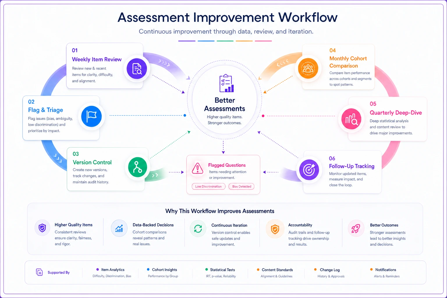
Monthly cohort comparison
Compare the same questions across different groups:
-
Morning vs afternoon sessions
-
Different instructors' classes
-
Various geographic locations
-
Online vs in-person test-takers
Significant performance gaps indicate environmental factors rather than question problems. A retail training program discovered their West Coast locations consistently scored 15% lower on inventory questions—turned out they used different inventory software requiring translation of concepts.
Quarterly deep-dive analysis
Every quarter, run full analysis on your entire question bank:
-
Retirement list
Questions failing for 2+ quarters
-
Watch list
Questions trending toward problems
-
Star performers
Questions to model new items after
-
Coverage gaps
Topics with too few quality questions
This systematic approach beats the common "wait for complaints" method that lets problems fester for years.
The operational reality of assessment improvement
Without proper item-level analysis, assessments drift toward either meaningless (everyone passes) or punitive (arbitrary failures). Neither serves the actual purpose of measuring competency.
A healthcare organization learned this the hard way. Their annual competency assessment had slowly evolved into a participation checkbox—94% pass rate, 15-minute average completion. When joint commission auditors started asking about actual competency validation, they couldn't demonstrate their assessment measured anything meaningful. Six months of remediation followed.
The other extreme hurts just as much. An engineering firm's certification became so notorious for trick questions that qualified engineers started failing. Word spread. Recruitment suffered. They had to rebuild the entire assessment program from scratch, analyzing three years of historical item-level data to identify where things went wrong.
Implementation without drowning in data
Start small. Pick your highest-stakes assessment and analyze just the top and bottom 10% of questions by difficulty. Fix those obvious problems first.
One software company improved their certification pass rate by 18% just by fixing their five worst questions.
Use this monthly dashboard format:
-
Assessment Health Snapshot
-
Questions flagged for review
[number]
-
Average discrimination index
[trending up/down/stable]
-
Difficulty distribution
[too easy/balanced/too hard]
-
Response pattern concerns
[specific issues]
-
Actions taken last month
[specific fixes]
-
Results of changes
[metrics impact]
This fits on one page and gives leadership what they need without statistical overload.
Managing multiple assessment programs gets complicated fast. Operational software helps centralize this analysis instead of juggling spreadsheets. Platforms now automatically flag problematic questions, track remediation efforts, and measure improvement over time. The manual work of calculating discrimination indices and generating reports gets handled through automation, letting your team focus on fixing problems rather than finding them. These AI-powered operational systems can identify patterns across thousands of questions that would take weeks to spot manually.
Making item-level analysis sustainable
The biggest failure in assessment programs isn't bad statistics—it's abandoning analysis when it becomes too burdensome. Build sustainability from the start.
Assign ownership clearly. One person should own item-level analysis for each assessment program. Not a committee, not "whoever has time"—one accountable person with scheduled time for this work.
Block a recurring 1-hour weekly slot for the designated owner to prevent backlog and ensure timely reviews.
Set realistic thresholds. You don't need perfect questions, just questions good enough to make valid decisions. Chasing statistical perfection leads to analysis paralysis while genuinely broken questions stay in rotation.
Create feedback loops that actually close. When instructors report a confusing question, they should see evidence of review and action within two assessment cycles. Otherwise they stop reporting issues.
Connect item-level metrics to business outcomes. Show how fixing low-discrimination questions reduced re-testing costs. Demonstrate how removing too-easy questions improved customer perception of certification value. These connections get resources allocated to sustain the program.
The path forward
Item-level analysis doesn't require statistical expertise—it requires systematic attention to a few key metrics and the discipline to act on what you find. The playbook is straightforward: measure difficulty and discrimination, visualize patterns simply, run targeted experiments, and build sustainable workflows.
Every bad question you leave in circulation undermines faith in your assessment program. But every improvement based on solid item-level analysis builds credibility that compounds over time.
Start with your next assessment cycle. Pull the data, calculate basic metrics, identify your worst three questions, and fix them. Measure the impact. Build from there. Within six months, you'll have transformed assessment quality without hiring a statistician or completely rebuilding your program.
The tools and knowledge exist. The question is whether you'll keep accepting assessment mediocrity or start the systematic improvement process that separates professional programs from checkbox exercises.
Start with your next assessment cycle. Pull the data, calculate basic metrics, identify your worst three questions, and fix them. Measure the impact. Build from there. Within six months, you'll have transformed assessment quality without hiring a statistician or completely rebuilding your program.
Ready to revolutionize your evaluation process?
Join over 2,000 organizations using Evaloly to optimize assessments, improve learner outcomes, and make data-driven decisions.