

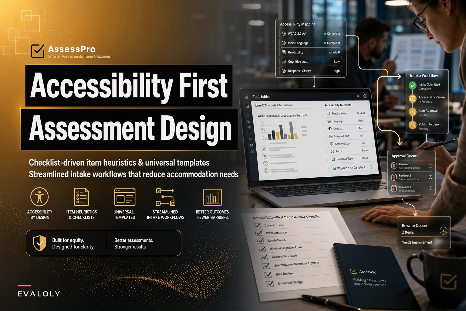

Most accessibility problems in assessments don't start in the accommodations office. They start weeks earlier, when someone writes an item that leans on a color-coded chart, or drops a 90-word stem full of double negatives, or builds a drag-and-drop question that only works with a mouse. By the time a screen reader user hits that item, the "fix" is a scramble — an emailed alt-text request, a last-minute extended-time approval, a proctor reading a graph aloud over a call.
The frustrating part is that a lot of that work is avoidable. Not all of it — genuine disabilities will always require genuine accommodations — but a surprising share of accommodation volume is really just cleanup for items that were never designed to be accessible in the first place. That's the gap assessment accessibility by design actually closes: you write and template your way out of demand instead of processing it one request at a time.
This post is narrow on purpose. It's about the item-writing heuristics, the reusable templates, the testing steps, and the intake handoffs that keep accessibility from becoming a per-candidate emergency. If you want the downstream policy side — the audit checklist, the approval workflow, the documentation — that's covered in our piece on how to avoid validity gaps with an operational accommodations policy. This one is about the front end, where the debt gets created.
The accommodation-debt pattern (and why item writers cause most of it)
Think of every inaccessible item as a small loan taken out against future operational time. The interest gets paid later, by a different team, usually under deadline pressure.
A pattern that shows up regularly in mid-sized programs: a certification body runs a bank of around 1,200 items. Nobody wrote them with accessibility in mind — they were written to be technically correct and psychometrically sound, which are real goals, just incomplete ones. When accommodation requests come in, staff triage them item by item: this candidate needs a text alternative for that diagram, that one needs the matching item reformatted, another needs the timed reading passage adjusted.
What nobody notices is that the same 40 or 50 items generate the vast majority of the friction. It's rarely evenly distributed. A small cluster of visually dependent, cognitively overloaded, or interaction-heavy items produces most of the accommodation labor. Fix those at the source and the request queue shrinks without anyone touching the accommodations policy.
The reason writers cause this isn't carelessness. Accessibility isn't in their working checklist. Item writers are trained to think about construct alignment, distractor plausibility, and difficulty. Accessibility shows up — if it shows up at all — as a vague "make it fair" instruction with no operational meaning. Give a writer a specific heuristic ("stems under 40 words, no meaning carried by color alone") and they'll follow it. Give them "be accessible" and you'll get a shrug.
Item-writing heuristics that reduce accommodation need
The goal isn't to write for one disability. It's to write items that need fewer alterations across the board — so that extended time, alternate formats, and reader accommodations become less frequent because the item was already navigable.
Eliminate assessment bottlenecks.
Evaloly simplifies every step from test design to results analysis, making assessments faster and more reliable.
- Customizable test creation
- Automated grading and analytics
- Secure distribution and proctoring
No credit card required
A few heuristics do most of the heavy lifting:
-
Never let color or position alone carry meaning. If the answer depends on "the red bar" or "the shape on the left," it breaks for color-blind candidates and for anyone using a linearized screen-reader view. Label the data. Reference the value, not the color.
-
Cap stem length and strip syntactic load. Long stems with nested clauses and double negatives inflate reading time, which quietly inflates extended-time requests. A candidate who needs 40% more time on a bloated stem might need almost none on a clean one. Shorter, direct stems reduce the reason for the accommodation, not just the impact.
-
Separate the construct from the delivery. If you're testing statistical reasoning, a fancy interactive chart is delivery, not construct. Ask whether the same skill can be measured with a simple table and a clean question. Interactive elements are where most "this doesn't work with my assistive tech" tickets come from.
-
Write text alternatives at authoring time, not on request. Every image, chart, or media element should ship with its alt text or long description written by the person who knows what it's testing. Retrofitting alt text later is where accuracy dies — someone describing a graph months after the fact routinely gets the emphasis wrong and quietly changes item difficulty.
-
Avoid layout-dependent answer logic. Matching, drag-and-drop, and hotspot items are the usual suspects. They're not banned, but each one needs a keyboard-operable path and a fallback format defined before it enters the bank.
-
Keep numbers and units unambiguous in plain text. "1,000" read aloud by a screen reader is fine; a value buried inside an image is not. Anything a candidate needs to answer should exist as real, selectable text somewhere.
Write text alternatives at authoring time — the person who knows what it's testing should write the alt text.
One thing worth sitting with: several of these heuristics reduce reading and processing load generally. That means they help candidates with no documented disability at all — non-native speakers, tired people, anyone taking the test at the end of a long day. Accessibility-by-design tends to lift measurement quality across the whole population, not just the accommodated slice.
A universal item template that bakes accessibility in
Heuristics fade if they live in a training deck nobody reopens. The reliable move is to encode them into the template writers actually type into. When accessibility fields are required to submit an item, they stop being optional.
A workable universal item template has these accessibility-relevant fields:
| Template field | What it enforces | Why it reduces accommodation load |
|---|---|---|
| Stem (word count auto-flagged) | Warns above ~40 words | Cuts reading-time-driven extended-time requests |
| Construct tag | Names the skill being measured | Lets reviewers catch when delivery ≠ construct |
| Media present? (Y/N) | Forces a decision | Triggers the alt-text requirement |
| Alt text / long description | Required if media = Y | Kills retrofit inaccuracy |
| Color-dependence check | Writer confirms no meaning-by-color | Prevents the single most common visual failure |
| Interaction type | Standard / matching / drag / hotspot | Flags items needing keyboard + fallback checks |
| Fallback format defined? | Required for non-standard interactions | Ensures an accessible path exists before publish |
| Plain-language reviewed? | Writer/reviewer sign-off | Reduces cognitive-load accommodations |
The value of a shared template isn't the fields themselves — it's that they make the invisible visible at the exact moment someone can still fix it cheaply. A writer forced to answer "does any answer depend on color?" will rewrite the item in thirty seconds. The same fix after publication involves a reviewer, a version bump, and a re-approval.
Programs using operational assessment platforms with configurable item forms can make these fields mandatory at the schema level, so an item literally can't be saved without the accessibility metadata attached. It's a small thing with an outsized effect — it converts "we should remember to do this" into "the system won't let us forget."
Accessibility testing steps for items and forms
Templates catch a lot. They don't catch everything, because some failures only show up in actual assistive technology. You need a lightweight testing pass — not a full audit for every item, but a proportionate one.
A practical sequence:
-
Automated scan first. Run items through an automated accessibility checker for the obvious stuff: missing alt text, contrast failures, unlabeled controls. This is cheap and catches roughly half the issues. Don't trust it to catch the rest.
-
Keyboard-only pass. Unplug the mouse. Tab through the item. If you can't reach every option, select an answer, and move on using the keyboard alone, a screen reader user can't either. This single step surfaces most interaction failures.
-
Screen-reader spot check on high-risk items. You don't need to screen-read all 1,200 items. Prioritize anything with media, non-standard interactions, or tables. Listen for whether the alt text actually answers the question or just describes decoration.
-
Linearized view check. View the item as a single top-to-bottom stream, ignoring visual layout. If it stops making sense, the item depends on spatial arrangement — a red flag.
-
Cognitive load read-through. Have someone unfamiliar with the item read the stem once. If they need a second pass to parse the sentence, the item is doing reading-comprehension work it wasn't meant to do. Trim it.
-
Fallback verification. For any interaction-heavy item, confirm the defined fallback format actually delivers the same construct and roughly the same difficulty.
The mistake is treating testing as pass/fail for the whole form. Test at the item level, tag failures, and route them back to writers with the specific heuristic they missed. That closes the loop — writers who see their own recurring failures tend to stop making them.
Wiring accessibility into intake and accommodation workflows
Even a well-built, well-tested bank still has some items that need per-candidate accommodations. You want that handoff to be clean.
When a candidate submits an intake or accommodation request, the request should be able to pull the item-level accessibility metadata captured up front. If a candidate needs a text alternative for graphical content, fulfillment shouldn't require someone to hunt down the item and describe it from scratch — the long description already exists in the template. The request becomes "apply the existing alternative" instead of "create one under deadline."
[Candidate submits intake/accommodation request] ↓ [System maps request against item-level accessibility metadata for that form] ↓ [Branch] / \ [Item has [Item needs pre-built manual alternative] handling] ↓ ↓ [Applied [Routes to automatically] human review] ↓ ↓ [Accommodation logged against item] ↓ [Patterns surface → repeat triggers → item added to rewrite queue]
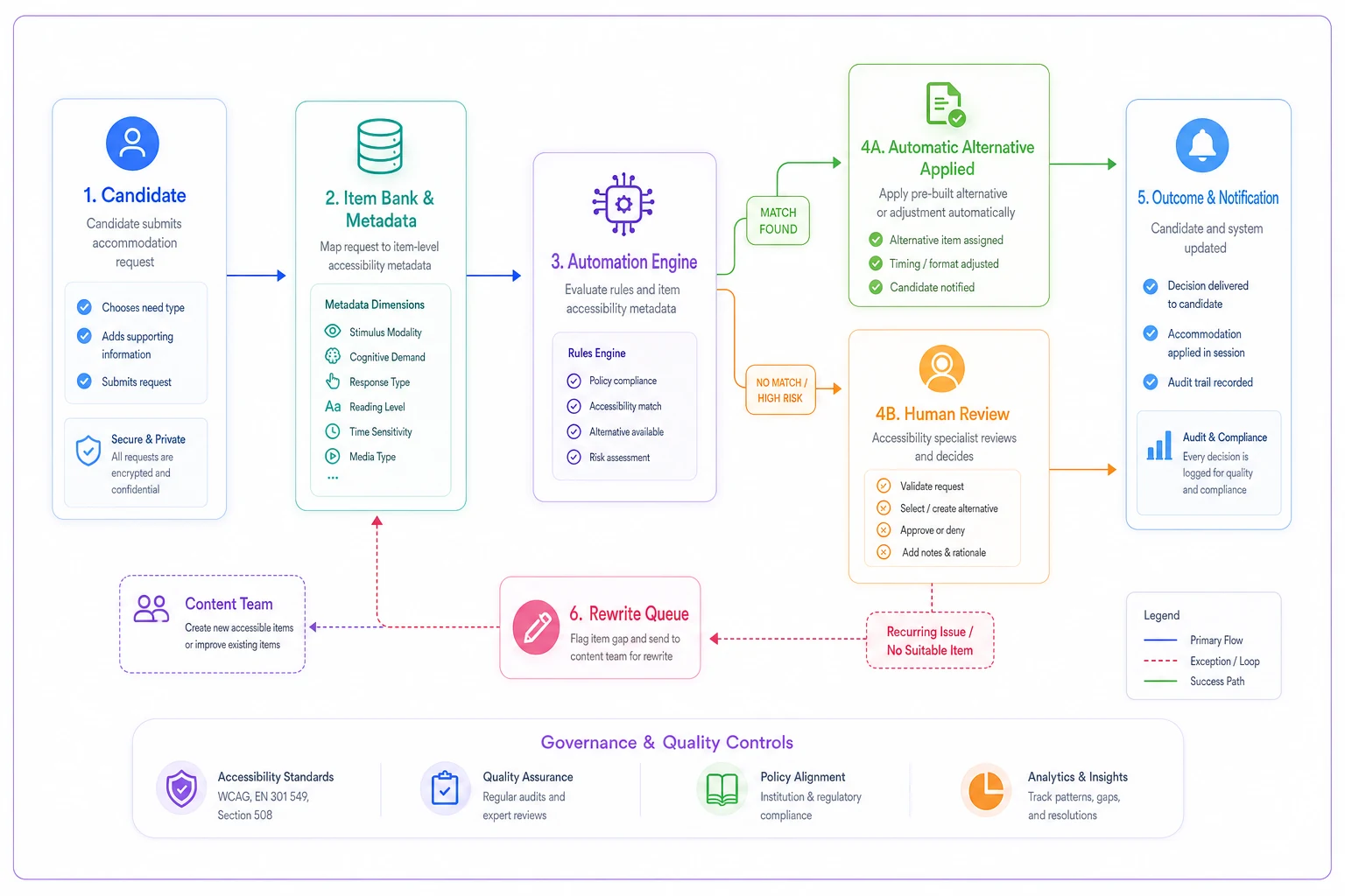
This diagram illustrates the workflow above.
That last loop is where design and operations reinforce each other. Accommodation data becomes a rewrite signal. Instead of processing the same request indefinitely, you retire the item's accessibility problem at the source. Over a couple of test cycles, the manual queue shrinks because the offending items keep getting fixed.
This is where platforms that connect item authoring, testing, and intake in one system earn their keep — not because the automation is impressive, but because the metadata written at authoring time is still attached when the accommodation request arrives months later. When those systems are disconnected, that context is lost every time and you rebuild it by hand.
A real scenario: a mid-sized certification program
A professional certification body — roughly 4,000 candidates a year, item bank around 1,500 — was fielding a steady stream of accommodation requests, and a big share of them were format-related: describe this chart, reformat this matching item, extend time on the long-reading sections. Fulfillment was manual and slow, and the same handful of items kept surfacing.
They ran a targeted pass. Rather than auditing everything, they pulled the items that had generated the most format-related requests over the previous year — about 60 items — and rewrote them against the heuristics above: color dependence removed, stems trimmed, alt text written by the original SMEs, non-standard interactions given keyboard-operable fallbacks. Then they folded the accessibility fields into the standard item template so new items shipped clean.
The operational relief was real, even if it wasn't dramatic on paper. Format-related accommodation requests dropped noticeably — not to zero, but enough that fulfillment stopped being a bottleneck. Extended-time requests tied to the reworked reading sections eased once the stems were leaner. And because alt text now lived in the item record, the requests that did come in were fulfilled faster, since nobody had to reconstruct what a chart was supposed to convey.
The lesson wasn't "we solved accessibility." It was narrower and more useful: a small set of poorly designed items was generating most of the manual work, and fixing those items at the source was cheaper than processing their consequences indefinitely.
When this approach makes sense — and when it doesn't
Building accessibility into item design pays off when you have a stable, reused item bank and recurring accommodation volume. If items live for years and candidates cycle through regularly, front-loading the design work amortizes well.
It makes less sense for genuinely one-off assessments — a single internal training quiz used once and discarded. There, the retrofit-on-request model is fine, because there's no future volume to save against.
One caution worth stating plainly: accessibility-by-design reduces accommodation need, it does not eliminate accommodations. Anyone treating design heuristics as a reason to scale back their accommodations process is misreading this. Some candidates will always require individualized accommodations, and that's not a failure of item writing — it's the whole point of having a real policy. The design work handles the avoidable volume so your accommodations team can focus on genuine cases.
Where to start this week
If you're staring at a bank you didn't build with accessibility in mind, don't try to audit everything at once. Pull your accommodation request logs and find the items generating repeat format requests — that's your high-value target list, and it's usually shorter than you'd expect. Rewrite those against the heuristics. Then fold the accessibility fields into your item template so the problem stops regenerating.
The whole logic of assessment accessibility by design is that you're cheaper and more accurate at the front end than at the back end. An item writer spending thirty seconds confirming no answer depends on color will always beat a stranger describing that same chart under deadline three months later. Build the guardrails into the template, test at the item level, wire the metadata through to intake — and the accommodation queue stops feeling like an emergency and starts feeling like what it should be: a small, manageable set of genuine individual needs.
The whole logic of assessment accessibility by design is that you're cheaper and more accurate at the front end than at the back end. An item writer spending thirty seconds confirming no answer depends on color will always beat a stranger describing that same chart under deadline three months later. Build the guardrails into the template, test at the item level, wire the metadata through to intake — and the accommodation queue stops feeling like an emergency and starts feeling like what it should be: a small, manageable set of genuine individual needs.
Ready to revolutionize your evaluation process?
Join over 2,000 organizations using Evaloly to optimize assessments, improve learner outcomes, and make data-driven decisions.