

Most score-reporting problems don't come from bad data. They come from good data landing in front of someone who doesn't know what the number actually means — and then acting on it anyway.
A hiring manager sees a 78 and rejects a candidate because "we usually only move people above 80." Nobody told them the scale isn't a percentage, the standard error is ±5, and 78 vs. 80 is statistical noise. An executive sees a cohort average drop from 71 to 66 and asks why "quality is declining," when the real story is that the test form changed and those two numbers aren't on the same scale. HR pulls a pass rate into a board deck without a confidence interval, and now there's a compliance conversation happening off a number that was never meant to carry that weight.
That gap — between the report and the reader — is what score reporting literacy actually addresses. Not more dashboards. Not prettier charts. A deliberate, small, repeatable training layer that teaches each stakeholder group exactly what they're allowed to conclude from the scores they see.
This post lays out how to build that layer as micro-training: one-sheets, scenario exercises, decision checklists, and reporting templates keyed to three audiences. If you've already invested in stakeholder-specific reporting templates, this is the companion piece that makes sure people actually read them correctly.
Why literacy fails even when the reports are good
Reporting quality and reporting literacy are two separate things, and organizations almost always invest in the first while ignoring the second.
You can build a beautiful report with error bands, footnotes, and clear scale labels. The manager still reads the big number in the middle and skips everything else. That's not a design failure — it's a training failure. People read reports the way they've been taught to read reports, and most have never been taught anything specific about assessment scores.
-
Scale confusion. Scaled scores, percentiles, raw scores, and percent-correct all get treated as interchangeable. A percentile of 60 and a scaled score of 60 mean completely different things, and nobody flags it.
-
Precision illusion. A score of 73.4 looks precise, so people treat a 2-point difference as meaningful when the measurement error is larger than the gap.
-
Comparison across incomparable things. Cohorts on different forms, different years, or different accommodation setups get lined up in the same bar chart.
-
Ignoring the direction of error. People act as if a score is exact rather than a best estimate inside a range.
The reason this persists is structural. Score reports get handed off to people whose job isn't measurement. They have thirty seconds, a decision to make, and no framework for how much confidence the number deserves. So they default to the intuition they already have — usually "higher is better, and small differences matter" — which is wrong often enough to cause real damage.
The real cost of low literacy
The consequences aren't abstract. They show up as bad decisions that look defensible on paper.
Eliminate assessment bottlenecks.
Evaloly simplifies every step from test design to results analysis, making assessments faster and more reliable.
- Customizable test creation
- Automated grading and analytics
- Secure distribution and proctoring
No credit card required
Consider a mid-sized employer running a competency assessment for internal promotions. The cut score is 70. Over one cycle, roughly 40 candidates land between 68 and 72 — squarely inside the standard error of measurement. Managers, untrained on how to read the band, treat 70 as a hard line. Candidates at 69 get passed over; candidates at 71 advance. Statistically, those two groups are indistinguishable. Now there's an adverse-impact question sitting in the data that nobody intended to create, and it traces directly back to reading a fuzzy number as a sharp one.
Or take the executive side. A learning team reports that assessment scores "improved 8%" year over year. The number goes into a QBR, gets repeated in a board summary, and becomes a talking point about program effectiveness. Six months later someone discovers the improvement came from an easier form, not better performance. Now every number that team has ever reported is suspect, and rebuilding that credibility takes far longer than the training would have.
The quiet cost is trust erosion. Once a stakeholder gets burned by a misread number — theirs or someone else's — they start discounting all assessment data. You end up with expensive measurement infrastructure that nobody actually uses for decisions, because the people receiving the reports don't know which numbers to believe.
Build the curriculum around decisions, not concepts
The mistake most training programs make is teaching measurement theory. They start with validity, reliability, standard error, and scaling as abstract concepts. Executives tune out by slide three, and honestly, that's fair — they don't need the theory, they need to know what they're allowed to do with the number in front of them.
Flip it. Build each module around a decision the stakeholder actually makes, and teach only the literacy required for that decision.
| Stakeholder | Decisions they make with scores | What they actually need to understand | What they can skip |
|---|---|---|---|
| HR / Talent | Pass/fail, advance/hold, compliance reporting | Cut scores, error bands, adverse-impact basics, comparability rules | Item statistics, equating math |
| Managers | Coaching, placement, readiness calls | Score ranges, "meaningful difference" thresholds, what a single score can't tell you | Scaling methods, reliability coefficients |
| Executives | Budget, program continuation, board narrative | Trend caveats, comparability across cycles, confidence framing | Anything below the aggregate level |
The point of this table isn't the specific rows — it's the principle. Each group gets a different, narrow slice. You are not trying to make anyone a psychometrician. You are trying to prevent the three or four specific misreads that group is most likely to commit.
The one-sheet: the core artifact
Everything anchors to a single-page reference per stakeholder group. If a one-sheet spills onto a second page, it's failing at its job. People keep one-sheets pinned near their desk or bookmarked; they don't read manuals.
A strong score-literacy one-sheet has four zones:
-
The scale decoder. A plain-language line for each score type they'll see. "This is a scaled score from 200–800. It is NOT a percentage. A 500 is average." Two sentences, no jargon.
-
The 'how sure are we' band. State the typical error range for the scores they see, in the units they see. "Scores within about ±4 points of each other should be treated as the same." This one line prevents most bad micro-decisions.
-
The comparison rules. Explicit yes/no on what can be compared. "You CAN compare candidates on the same form in the same window. You CANNOT compare across years without checking with the assessment team."
-
The stop-and-ask triggers. Three or four situations that should freeze the decision. "If a decision hinges on a difference smaller than the error band, stop and ask."
An HR one-sheet reads differently from an executive one-sheet, even though the underlying scores are identical. HR needs the cut-score band spelled out precisely. Executives need one clear sentence about why year-over-year trends can be misleading and what to check before repeating a number publicly.
Scenario exercises that actually change behavior
Reading a one-sheet doesn't build literacy. Making a decision, getting it wrong, and seeing why does. That's what scenario exercises are for, and they should be short — five minutes each, three or four per session.
The format that works: present a realistic score report, ask for a decision, then reveal the catch.
Example scenario for managers. "Two candidates for the same role: Candidate A scored 74, Candidate B scored 71, both on Form C this month. Who advances?" Most managers pick A. The reveal: the error band on this assessment is ±5, so 74 and 71 are statistically the same. The correct move is to advance based on other role-relevant evidence, not the 3-point gap. The lesson sticks because they made the wrong call first.
Example scenario for executives. "Last year's cohort averaged 68. This year's cohort averaged 75 on a new form. Your board deck says 'skills improved 10%.' What's the problem?" The reveal: the forms weren't equated, so the numbers aren't on the same scale, and the 'improvement' may be an artifact. The right move is to ask whether the forms were equated before putting the comparison in front of the board.
Rotate scenarios so people encounter the specific misreads their role is prone to. HR gets cut-score and comparability traps. Managers get "meaningful difference" and single-score-overreliance traps. Executives get trend and comparability traps. After a few cycles, the reflex — "wait, can I actually compare these?" — starts firing automatically.
Decision checklists that live inside the workflow
A checklist only works if it appears at the moment of decision, not in a training folder from six months ago. The goal is a short gate people run through before acting on a score.
-
Am I comparing scores from the same form and window?
-
Is the difference I care about larger than the error band on the one-sheet?
-
Am I basing this on one score, or do I have other evidence?
-
Does this decision have compliance weight? If yes, loop in HR before finalizing.
An HR checklist for cut-score decisions:
-
Are any candidates within the error band of the cut score? Flag them for a second look rather than a hard reject.
-
Are all candidates in this decision on comparable forms?
-
Is there an accommodation flag that affects how this score should be interpreted?
-
Would this decision pattern survive an adverse-impact review?
The value of the checklist isn't that it's clever. It's that it forces a two-minute pause between "I see a number" and "I act on the number." That pause is where most literacy actually happens.
Attach the checklist to the report view so people see it at the moment of decision.
A simple workflow to show where the checklist fits:
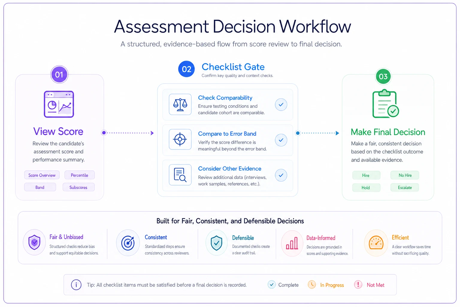
Putting that gate exactly at the decision point turns a document people forget into a prompt they see when it matters.
How reporting platforms fit into this
None of this requires software to start — a good one-sheet is a Word doc. But at scale, the friction shows up in keeping literacy artifacts synced with the reports themselves. When a scale changes, or a form gets re-equated, every one-sheet and checklist referencing the old error band is now wrong, and nobody remembers to update them.
This is where AI-assisted reporting platforms earn their place, quietly. When error bands, scale labels, and comparability rules live as metadata attached to the report, the one-sheet content can be generated straight from the current configuration — so the literacy guidance always matches the live data instead of drifting. Some platforms will also surface stop-and-ask triggers inline: a small flag next to a score difference that falls inside the error band, or a warning when someone tries to chart two non-comparable cohorts together. That turns the checklist from a document people forget into a prompt that appears at the decision point.
The automation isn't the star here. It just removes the maintenance burden that causes literacy materials to go stale — which is the main reason most well-intentioned training programs quietly die after a year.
When this level of curriculum makes sense — and when it doesn't
Building a full micro-training layer is worth it when scores drive consequential, repeated decisions — promotions, certifications, hiring gates, compliance reporting. If dozens of managers are making dozens of score-based calls every cycle, the literacy investment pays for itself the first time it prevents an adverse-impact problem or a bad board number.
It's overkill for a small internal quiz that informs nothing more than a follow-up email. If a wrong read on the score costs nothing, don't build a curriculum around it.
Who should skip most of this: teams whose stakeholders already have measurement backgrounds, or programs where a single trained analyst interprets every score before anyone else sees it. If interpretation is centralized and expert, you don't need to distribute literacy widely — you need to protect that analyst's time.
Who needs this most: any program where raw scores flow directly to non-specialists who then make decisions. That's the setup where a small, well-built curriculum prevents the largest number of expensive misreads.
A short real scenario
A regional healthcare employer ran a competency assessment for a clinical-support role, with around 200 candidates per cycle and a cut score of 70. Managers were rejecting anyone under 70 as a hard rule. Roughly 30–35 candidates per cycle sat in the 66–72 range — inside the ±4 error band — and the reject/advance split among them was essentially arbitrary.
They introduced a one-page HR reference and a pre-decision checklist, plus two five-minute scenario exercises in the manager onboarding flow. The one change that mattered most: candidates within the error band of the cut score got flagged for a structured second look instead of an automatic reject.
Within two cycles, the arbitrary splits inside the band dropped sharply, promotion decisions became defensible against a fairness review, and — maybe more importantly — managers started asking better questions in general. The whole intervention was a doc, a checklist, and about ten minutes of training. No new assessment. No new platform, at least not initially. Just literacy applied at the point of decision.
The takeaway
Better reports don't fix misuse. Trained readers do. Score reporting literacy is a small, unglamorous layer — one-sheets, five-minute scenarios, and a two-minute checklist at the moment of decision — but it's the difference between measurement data that drives good calls and measurement data that quietly generates defensible-looking mistakes.
Start with the decisions each group actually makes. Teach only the literacy those decisions require. Put the guidance where the decision happens, keep it to one page, and refresh it whenever the scales or forms change. That's the entire program. It's cheap to build, and it prevents the most expensive category of assessment error there is: the confident, well-documented wrong decision made off a number nobody understood.
Ready to revolutionize your evaluation process?
Join over 2,000 organizations using Evaloly to optimize assessments, improve learner outcomes, and make data-driven decisions.