
Last month, a training director showed me their assessment reporting system. Beautiful dashboards. Real-time analytics. Color-coded heat maps showing pass rates, completion times, score distributions. The whole nine yards. Then she opened her email and showed me seventeen different versions of the same basic report she'd manually customized for different stakeholders over the past quarter.
"The system generates everything," she said. "But nobody actually uses what it generates."
This disconnect between assessment data and actual business decisions ruins more L&D programs than bad content ever could. You can have perfect psychometric properties, validated questions, and bulletproof proctoring. None of it matters if your VP of Sales gets a 47-page PDF when they needed three bullet points about deal-closing skills gaps.
The problem isn't the data. It's that we're treating assessment reporting for stakeholders like a data dump instead of a decision-support system. Every audience—from frontline managers to C-suite executives—needs different metrics, different narratives, and different visualization formats to actually do something with assessment results.
Why generic reports create decision paralysis
Most assessment platforms generate reports like they're documenting a scientific experiment. Here's your mean scores. Here's your standard deviations. Here's your item discrimination indices. Congratulations, you've successfully confused everyone who actually needs to make a business decision.
A healthcare organization running certification assessments for 4,000+ nurses across twelve facilities had this exact problem. Their assessment system produced these comprehensive monthly reports—beautifully formatted, statistically rigorous, completely useless for actual operations. The CNO needed to know which units had competency gaps in specific procedures. Unit managers needed individual nurse readiness scores before shift assignments. The education team needed to identify which training modules weren't translating to assessment performance.
Instead, everyone got the same 35-page report with aggregate statistics and year-over-year trending charts.
The education director ended up spending about 15 hours each month translating these reports into what she called "decision documents"—one-page summaries with specific recommendations for each stakeholder group. She'd pull assessment scores, cross-reference them with shift schedules, map them to upcoming policy changes, and create these targeted narratives that people could actually act on.
That manual translation work is where assessment programs die. Not because the data is bad, but because the reporting treats every stakeholder like they have a PhD in psychometrics and unlimited time to interpret statistical outputs.
The three-audience problem that breaks most reporting systems
The pattern becomes obvious once you've watched dozens of organizations struggle with assessment reporting. You're really dealing with three fundamentally different audiences, each with distinct decision contexts:
Eliminate assessment bottlenecks.
Evaloly simplifies every step from test design to results analysis, making assessments faster and more reliable.
- Customizable test creation
- Automated grading and analytics
- Secure distribution and proctoring
No credit card required
Executives need prediction and risk assessment. They don't care about individual question performance. They need to know: Will our sales team hit quota based on current competency levels? What's our compliance risk if 23% of operators failed the safety assessment? How much productivity are we losing to skill gaps?
HR and L&D managers need operational diagnostics. They're looking for patterns across teams, correlations with other HR metrics, intervention opportunities. Which departments consistently struggle with technical assessments? Do assessment scores predict turnover? What's the ROI on our certification program?
Frontline managers and trainers need individual prescription. They make daily decisions about task assignments, coaching priorities, development plans. They need names, specific competencies, and actionable next steps. Not averages and distributions.
Most reporting systems pretend these are the same audience. They're not. And when you force everyone to extract their specific needs from generic reports, you get what I call "report shopping"—stakeholders keep requesting different views, different cuts, different formats until someone (usually an overworked L&D analyst) manually creates what they actually needed in the first place.
A financial services firm had their assessment data flowing into seventeen different reporting formats. Seventeen. Not because they were data-obsessed, but because each stakeholder kept asking for "just one small modification" to make the reports useful for their specific decisions. The compliance team needed assessment results mapped to regulatory requirements. Sales leadership wanted performance predictions based on product knowledge scores. Regional managers needed comparative analytics across branches.
Building decision-specific reporting templates
The solution isn't more dashboards or fancier visualizations. It's accepting that different decisions require fundamentally different data presentations. When you map metrics to real stakeholder decisions, patterns emerge that work consistently across organizations:
Here's a simple workflow for turning assessment data into stakeholder-specific reports:
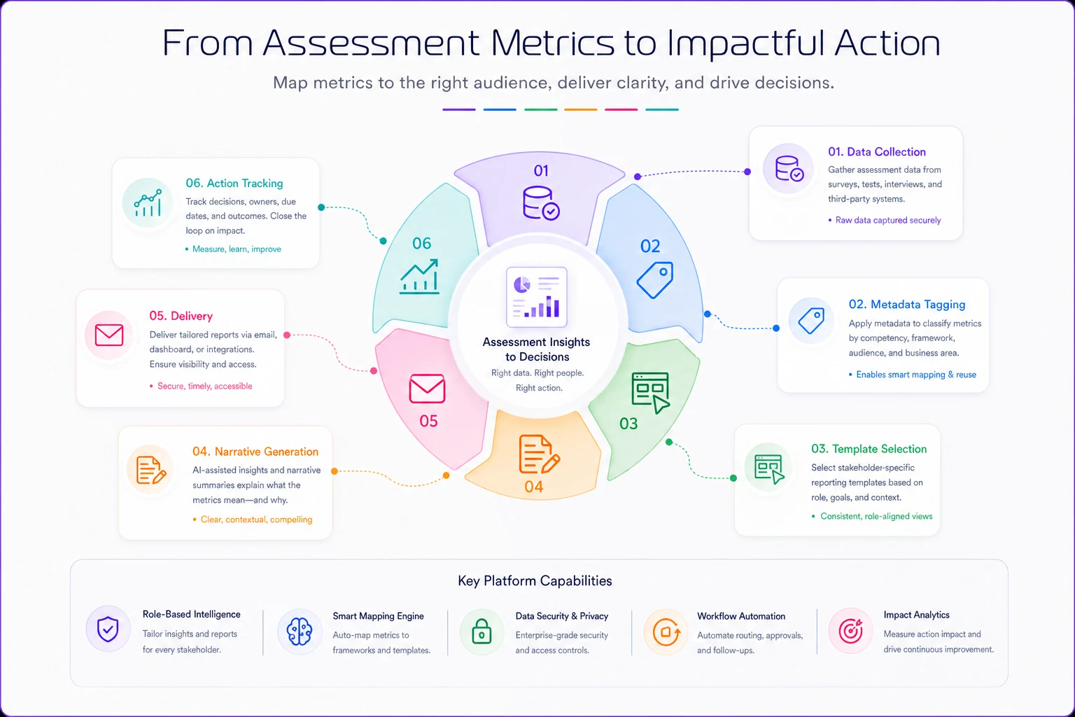
This workflow shows how data becomes a decision-support output.
Executive reporting: Strategic narrative with prediction models
Executives don't want to see individual assessment scores or question-level analytics. They need assessment data translated into business impact. Your executive reporting template should answer three questions:
-
What business risk or opportunity does this assessment data reveal?
-
What's the financial or operational impact?
-
What decision do you need from me?
The most effective executive assessment reports follow a tight narrative structure. One manufacturing company transformed their safety assessment reporting by creating what they called "Risk Intelligence Briefs." Instead of showing pass/fail rates, they showed:
-
Predicted incident probability based on assessment scores
-
Estimated cost exposure from identified skill gaps
-
Recommended investment to close critical gaps
-
90-day risk trajectory with and without intervention
The entire report fit on two pages. No individual scores, no statistical terminology, just business implications derived from assessment data.
HR/L&D reporting: Pattern recognition with intervention triggers
Your learning and development team needs to see patterns across populations and connect assessment performance to other talent metrics. But they also need clear triggers for when to intervene.
The template that consistently works includes these components:
Performance distribution maps showing not just averages but the full distribution curve with clearly marked intervention zones. If more than 15% of a population falls below competency threshold, that's flagged for curriculum review.
Correlation matrices linking assessment scores to other HR data points. Do low assessment scores correlate with turnover risk? Performance ratings? Engagement scores? This isn't about causation—it's about identifying populations that need attention.
Learning pathway effectiveness tracking that shows which training interventions actually move assessment scores. This seems obvious but most organizations never close this loop. They run training, they run assessments, but they rarely connect the two systematically.
Frontline reporting: Individual prescriptions with clear actions
Managers and trainers don't need analytics—they need instructions. Who needs help? What kind of help? When should I provide it?
Your frontline reporting template should function more like a prescription pad than a data report:
Individual readiness cards for each team member showing specific competencies as ready/developing/gap with recommended actions for each state. No scores, no percentiles, just clear status indicators.
Weekly coaching priorities automatically generated from assessment data. "This week, focus on price objection handling with Sarah and technical specifications with Marcus." Specific, actionable, time-bound.
Skills gap heat maps at the team level showing which competencies need group intervention versus individual coaching. If everyone struggles with the same assessment area, that's a training issue, not a performance issue.
The metadata and tagging infrastructure everyone forgets
What kills most stakeholder reporting systems: they try to generate these targeted reports from assessment data alone. But assessment scores without context are just numbers. You need rich metadata and systematic tagging to make reporting actually useful.
A retail chain learned this the hard way. They had beautiful assessment data on product knowledge, customer service skills, sales techniques. But they couldn't answer simple questions like "How do our holiday hires compare to regular staff?" or "Are morning shift employees better prepared than evening shift?" because they never connected assessment data to operational metadata.
Your minimum viable metadata structure needs:
-
Organizational hierarchy (department, team, location)
-
Role and tenure information
-
Training history and interventions
-
Performance context (shift patterns, account types, territory)
-
Business cycle markers (hiring cohort, season, product launch)
This feels like administrative overhead but it's what transforms raw scores into actionable intelligence. When a score is low, you need to know: Is this a new hire issue? A location-specific problem? A training gap from a recent product launch?
The tagging schema should mirror your business operations, not your assessment structure. Tag assessments by business process, not just learning objective. Map competencies to actual job tasks, not theoretical frameworks. This alignment work—connecting assessment strategy to business outcomes—determines whether your reports drive decisions or gather dust.
Sample narrative templates and wireframes for each audience
Different templates actually look like in practice. Not theory, but actual formats that organizations use to drive decisions from assessment data.
Executive one-sheet template
Header Section:
-
Business Impact Statement (one sentence)
-
Risk/Opportunity Score (single number with trend arrow)
-
Required Decision (specific ask with deadline)
Visual Section:
-
Single chart showing business metric projection based on assessment data
-
No more than three data points
-
Clear intervention/no-intervention scenarios
Narrative Section (3 paragraphs max):
-
Current state and why it matters to business goals
-
Root cause from assessment data (simplified, no statistics)
-
Recommended action with ROI estimate
Footer Section:
-
Next review date
-
Single point of contact for questions
One pharmaceutical company used this exact template to secure $2.4M in additional training investment. They showed how assessment scores in GMP procedures predicted quality incidents, translated that to FDA warning letter risk, and made the business case in under 500 words.
HR/L&D operational dashboard template
Section 1: Population Health Metrics
Overall Competency Index: 73% (target: 85%) Critical Gap Areas: 3 of 12 Population at Risk: 234 employees (18%) Intervention Budget Required: $156K
Section 2: Pattern Recognition Grid
| Department | Competency Score | Turnover Risk | Performance Rating | Action Priority |
|---|---|---|---|---|
| Sales - East | 67% | High | 3.2/5 | URGENT |
| Operations | 81% | Low | 4.1/5 | Monitor |
| Customer Success | 72% | Medium | 3.8/5 | Plan Intervention |
| Sales - West | 78% | Low | 4.3/5 | Maintain |
Section 3: Intervention Effectiveness Tracker
The section lists each training intervention from past quarter, shows pre/post assessment score movement, calculates cost per competency point gained, and flags underperforming programs for review.
Section 4: Predictive Alerts
Based on historical patterns, this section flags upcoming risk periods. "Q4 typically sees 15% competency drop in seasonal hires" or "Technical certification expires for 67 employees next month."
Trainer/Manager action sheet template
Today's Coaching Priorities
-
MORNING FOCUS
-
Sarah M.
Product knowledge gap in premium features (15-min review)
-
Marcus L.
Needs practice with objection handling (role-play session)
-
Team huddle topic
New compliance requirement (failed by 40% yesterday)
Individual Progress Cards
[Name] [Photo] ✅ Core Competencies: READY ⚠️ Advanced Skills: DEVELOPING (target: March 15) ❌ New Product Training: GAP (schedule by: Feb 28) Next Assessment: March 20 Recommended Action: Shadow Jennifer on premium sales calls
Weekly Team Snapshot
Not a data table, but a visual grid showing faces/names in green/yellow/red based on readiness. Clicking a face shows specific development actions. Group patterns highlighted at top ("Entire team needs refresher on returns process").
The dangerous gap between data generation and decision making
The real test of assessment reporting isn't whether stakeholders receive reports—it's whether those reports change behavior. Most organizations have this backwards. They measure report delivery, not decision impact.
A technology company ran quarterly skills assessments for their entire engineering team. Beautiful data. Comprehensive reports. Zero behavior change. Why? The reports arrived three weeks after the assessment window closed, formatted for HR but sent to engineering managers, with no clear connection to sprint planning or project assignments.
The assessment data showed clear competency gaps in cloud architecture. The engineering managers continued assigning cloud migration projects to the same people. The disconnect was so complete that when I asked a team lead about assessment results, he said, "Oh, those HR reports? I file them in case someone asks."
This gap exists because we treat reporting as the end of the assessment process instead of the beginning of the intervention process. Your reports should trigger specific workflows:
When executive reports show critical risk:
-
Automatic calendar holds for strategy review
-
Pre-populated decision templates for resource allocation
-
Escalation workflows if no action taken within 72 hours
When HR reports identify patterns:
-
Triggered curriculum review processes
-
Automated budget impact calculations
-
Cross-functional alerts to affected departments
When manager reports flag individual gaps:
-
Development plan templates pre-filled with recommended actions
-
Calendar integration for coaching sessions
-
Progress tracking initiated automatically
Your reports should trigger specific workflows.
Version control and iteration cycles for reporting templates
Static reporting templates die fast. Your business changes, roles evolve, and what worked last quarter might be useless today. But most organizations treat report templates like stone tablets—sacred and unchangeable until they're so irrelevant that someone demands a complete overhaul.
Smart assessment programs build iteration cycles into their reporting infrastructure. Every template should have feedback loops built into the template itself. Not a separate survey, but a single question at the bottom: "Did this report help you make a decision today? Yes/No/Wrong Format." Track this religiously. When a template drops below 60% "Yes," it needs revision.
Quarterly template reviews should align to business cycles. Don't review all templates at once—that's a recipe for analysis paralysis. Review executive templates before board meetings. Review manager templates before performance cycles. Review HR templates before workforce planning.
A/B testing for format changes works better than wholesale revisions. When you modify a template, don't flip everyone at once. Run parallel versions for one reporting cycle. A healthcare company discovered that switching from tables to heat maps increased manager engagement with assessment reports by 400%—but only because they tested both formats simultaneously.
Version tracking with rollback capability matters more than most people think. Just like assessment version control, your reporting templates need version histories. When someone says "The old reports were better," you need to know exactly what changed and why.
When automated reporting actually makes things worse
Here's an uncomfortable truth: sometimes manual report creation beats automated templates. Not always, not even usually, but in specific contexts where the cost of misinterpretation exceeds the cost of manual effort.
A biotech company learned this after an automated assessment report incorrectly flagged an entire research team as "non-compliant" with safety protocols. The reality? They'd taken an updated version of the assessment that had different scoring thresholds. The automated report didn't account for this variation. The CSO nearly shut down a critical project based on faulty automated reporting.
Automated reporting breaks when the context requires narrative explanation. Numbers without story create dangerous misinterpretations. If assessment scores dropped because you intentionally raised standards, that needs explanation, not just data visualization.
Stakeholders who are hostile or skeptical present another challenge. When you're reporting to audiences who don't trust assessment data—maybe because of past failures or political dynamics—automated reports feel like propaganda. A human touch and customized narrative can break through skepticism.
The stakes involving personnel decisions create legal and ethical risks. Automated reports that rank or rate individuals need human review, contextual adjustment, and careful framing that automated systems can't provide.
Multiple assessment systems feeding the same decision create complexity that automated rules can't capture. When you're combining technical assessments, behavioral assessments, and performance data, the integration logic often requires human judgment.
Building the feedback-to-revision pipeline
The biggest mistake organizations make in assessment reporting? They create templates, deploy them, and never look back. Six months later, everyone's creating shadow reports in Excel because the official templates no longer match reality.
Your reporting system needs a built-in evolution mechanism. Monthly feedback harvesting should actively collect what stakeholders did with reports. Not satisfaction surveys—action logs. "I used this report to..." gives you more insight than "Rate this report 1-5."
Quarterly template audits compare intended use to actual use. If executive reports are being forwarded to managers for tactical decisions, your template boundaries are wrong.
Annual strategic alignment maps all reporting templates back to current business strategy. When the business pivots from growth to efficiency, your assessment reports need to pivot from readiness metrics to optimization indicators.
Real-time modification capabilities matter during crisis response. During COVID, organizations that could rapidly adjust assessment reporting to focus on remote work competencies maintained operational continuity. Those with rigid templates went blind just when they needed visibility most.
The difference between reporting and decision architecture
Most assessment reporting fails because it treats information delivery as the goal. But stakeholders don't need information—they need decisions. The best assessment reporting systems function as decision architecture, not just data pipelines.
This means your reports should define the decision space clearly. Not "here's the data," but "you need to decide between Option A, B, or C." Assessment scores become inputs to a decision model, not the output itself.
Include commitment mechanisms. Reports that require response create action. A simple "Based on this assessment data, I will..." field at the bottom of each report forces stakeholders to translate data into commitment.
Track decision quality over time. Not just whether decisions were made, but whether assessment-informed decisions produced better outcomes than gut-feel decisions.
Ready to revolutionize your evaluation process?
Join over 2,000 organizations using Evaloly to optimize assessments, improve learner outcomes, and make data-driven decisions.