

Most assessment programs don't fail because the measurement is bad. They fail because the people holding the budget can't see anything they can act on. They get a 40-page report full of p-values, reliability coefficients, and cohort charts, and then someone asks the only question that matters — "So do we keep funding this or not?" — and the room goes quiet.
That gap is what an enterprise assessment scorecard is supposed to close. Not another dashboard. Not a prettier report. A one-page instrument that connects a small set of leader-level signals directly to a decision: invest more, hold steady, scale it out, or shut it down and reallocate the money somewhere it actually earns its keep.
This is the piece that usually gets skipped. Teams pour effort into item analysis and validity studies, then hand executives a data dump and hope they draw the right conclusion. The scorecard flips that — it starts from the decisions leaders actually make with money and works backward to the handful of numbers that should move those decisions.
Why the reporting layer keeps breaking
The core problem is a mismatch of altitude. Psychometricians and assessment leads operate at item and form level. Executives operate at portfolio and budget level. When those two groups meet without a translation layer, one of two things happens.
Either the technical team over-shares — every metric, every caveat, every footnote — and the exec tunes out. Or the exec asks for "just the highlights," and the team strips out so much context that the numbers become meaningless. A pass rate of 78% means nothing without knowing the population, the stakes, the version history, and whether that's up or down from last cycle.
What tends to happen across larger L&D and assessment functions is that this breakdown gets worse as the program grows. When you're running three certification exams, informal reporting holds. When you're running thirty assessments across hiring, compliance, and internal upskilling — with different owners, vendors, and budgets — informal reporting collapses. Nobody can hold thirty programs in their head. Leaders start making funding calls based on which program owner is loudest in the meeting, not which one is actually producing outcomes.
The scorecard exists to kill that dynamic. Every program reports the same 8–12 signals in the same format, so a VP can compare a hiring assessment against a compliance exam without needing a translator in the room.
Picking the right 8–12 KPIs
The temptation is to pick metrics that are easy to compute. Resist that. The scorecard should carry metrics tied to decisions, even when they're harder to produce.
Eliminate assessment bottlenecks.
Evaloly simplifies every step from test design to results analysis, making assessments faster and more reliable.
- Customizable test creation
- Automated grading and analytics
- Secure distribution and proctoring
No credit card required
A workable leader-level set usually pulls from four buckets: measurement quality, business impact, operational health, and risk exposure. You don't need all of these at maximum depth — you need enough to make a defensible invest/stop/scale call.
Here's a starting set that holds up across different program types:
| KPI | What it signals | Decision it drives | Green tolerance | Red tolerance |
|---|---|---|---|---|
| Predictive/criterion signal | Does the assessment relate to real outcomes? | Invest vs. sunset | Correlation holds vs. defined outcome | No measurable relationship after 2 cycles |
| Reliability (form-level) | Are scores stable enough to act on? | Scale vs. hold | Within agreed band | Below floor for high-stakes use |
| Adverse impact ratio | Fairness / legal exposure | Stop / remediate | Above 0.80 rule of thumb | Sustained breach with no plan |
| Cost per scored candidate | Unit economics | Budget reallocation | Flat or declining | Rising with no volume reason |
| Time-to-score | Operational speed | Process investment | Within SLA | Chronic SLA misses |
| Completion / abandonment rate | Candidate experience | Redesign vs. keep | Stable | Climbing abandonment |
| Item bank health | Content sustainability | Content investment | Adequate fresh items | Exposure risk, thin bank |
| Outcome attribution | Business value | Invest / scale | Credible link to KPI | No link after fair test |
| Stakeholder adoption | Is anyone using results? | Stop / relaunch | Used in decisions | Reports ignored |
| Compliance status | Audit readiness | Mandatory hold | Documented, current | Gaps flagged |
Ten is plenty. The mistake teams make is adding a metric because it's interesting, not because it changes a decision. If a number can't move money — up, down, or sideways — it doesn't belong on the executive scorecard. Put it in the technical appendix.
For the impact and ROI columns specifically, the logic behind attribution and outcome-linking deserves its own treatment. It's worth grounding those metrics in a real strategy flow like turning learning goals into measurable ROI rather than inventing attribution on the spot.
Tolerances are the part everyone forgets
A KPI without a tolerance is just a number people argue about. The scorecard's real power comes from defining — ahead of time — what counts as green, yellow, and red, and what happens at each level.
This matters because it removes the emotion from the meeting. When adverse impact drops below the agreed line, nobody has to litigate whether it's "bad enough" to act on. The tolerance already said it triggers a remediation plan. When cost-per-candidate rises past the yellow band for two cycles running, the budget conversation is automatic, not political.
In practice, this usually comes up when a program that everyone likes starts quietly underperforming. Without pre-set tolerances, it coasts for another year because no one wants to be the one who flags it. With tolerances, the red cell does the flagging, and the conversation shifts from "should we look at this" to "what's the plan."
-
Set them before you see the current cycle's data, not after
-
Tie each red state to a specific action, not a vague "review"
-
Give yellow a defined meaning too — usually "watch, plan, decide next cycle"
-
Require two consecutive breaches for anything expensive, so you don't overreact to noise
-
Write down who owns the response for each metric
Name the owner and the action in the tolerance cell itself so the meeting can't stall on responsibility.
That last point is where a lot of scorecards fall apart. A red cell with no named owner is just anxiety on a page.
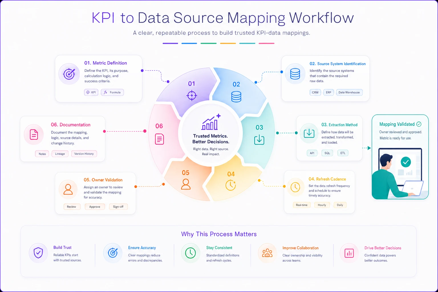
Mapping every KPI to a data source
Here's a failure mode that's almost universal: the scorecard looks great in the template, and then someone asks where the numbers actually come from. Turns out three of them are hand-pulled from a spreadsheet someone updates quarterly, one lives in the LMS, one comes from HRIS, and two are estimates nobody can reproduce.
If you can't trace a KPI back to a system of record, it will eventually produce a wrong number at the worst possible moment — usually right before a budget review. Every metric on the scorecard needs a documented source, a refresh cadence, and an owner responsible for the pull.
A simple mapping looks like this:
-
Name the metric and its exact definition (not "pass rate" — "first-attempt pass rate on Form B, active candidates only")
-
Identify the source system (assessment platform, LMS, HRIS, ATS)
-
Define the extraction method (API pull, standard export, calculated field)
-
Set the refresh cadence (real-time, monthly, per-cycle)
-
Assign an owner who validates the number before it hits the packet
-
Document the known caveats (small-n cycles, version changes, population shifts)
A workflow to operationalize the mapping looks like this.
Programs that do this well tend to have a coherent underlying data structure to pull from in the first place. When the assessment architecture is fragmented — scores in one place, candidate records in another, item metadata nowhere consistent — the scorecard becomes a monthly archaeology project. Getting the enterprise assessment architecture right upstream is what makes the reporting layer sustainable rather than heroic.
This is also where AI-assisted operational tooling earns its place, quietly. When your source mapping is defined, a lot of the extraction, validation, and packet assembly can be automated — flagging when a number falls outside tolerance, pulling cleaned figures into the one-pager, catching when a source hasn't refreshed. Not to replace judgment, but to remove the manual pull-and-paste that makes people avoid updating the scorecard at all. The decision stays human; the data plumbing doesn't need to be.
The one-page executive packet
The output of all this is a single page per program — or a single page per portfolio, depending on the meeting. The format matters more than people expect, because executives read hundreds of pages a week and the ones that get acted on are the ones that make the decision obvious.
A workable packet layout:
-
Top strip program name, owner, budget line, current decision gate status
-
KPI grid the 8–12 metrics with current value, trend arrow, and green/yellow/red state
-
The ask one sentence stating the recommended decision (invest / hold / scale / sunset)
-
Rationale three bullets max, tied to the red or green cells
-
Portfolio position where this program sits relative to others in cost and impact
The portfolio mapping is what turns individual packets into a procurement and budget tool. When you plot every assessment on a simple grid — impact on one axis, cost or risk on the other — the reallocation decisions surface on their own. Low-impact, high-cost programs are your sunset candidates. High-impact, low-cost programs are where you scale. This is the same logic behind building a decision rubric for your assessment portfolio, rendered down to something a leader can act on in a single glance.
Meeting scripts and cadence
A scorecard with no meeting is a document that dies in a shared drive. The cadence and the script are what keep it alive, and both should be deliberately boring.
Cadence works best on two rhythms. A monthly or per-cycle operational review where program owners update numbers and flag anything that's crossed a tolerance. And a quarterly portfolio and budget review where leaders make the actual invest/stop/scale calls using the full set of packets.
The script should be tight enough that a program can't be talked up beyond what its numbers support. A version that works:
-
Owner states the recommended decision in one sentence (30 seconds)
-
Walk only the red and yellow cells — greens get skipped (2 minutes)
-
Owner states the ask and the budget implication (1 minute)
-
Leaders ask clarifying questions against the tolerances, not against gut feel
-
Decision is recorded with a date and a next-review trigger
The single most useful rule: skip the green cells. Meetings die when someone narrates every metric that's fine. If it's green, move on. Time goes to what's off-tolerance, because that's the only thing that changes a decision.
When this scorecard actually makes sense
This approach fits when you're running enough assessment programs that comparison matters and money is genuinely being reallocated between them. Somewhere north of five or six programs, with real budget lines and multiple owners, the scorecard starts paying for itself in avoided bad funding decisions.
It also makes sense when leadership has been burned by opaque reporting and wants a defensible paper trail for procurement and budget choices — especially in regulated hiring or compliance contexts where "why did you keep funding this" is a question that shows up in audits.
When it's a bad idea
If you're running one or two assessments, this is overkill. A short informal update does the job, and building tolerances and packets for two programs is just ceremony.
It's also premature when your underlying data can't support the metrics. If you can't reliably produce reliability figures, adverse impact ratios, or cost-per-candidate, a scorecard built on those numbers will manufacture false confidence. Fix the data foundation first, then build the reporting layer on top. A polished red/green grid over unreliable numbers is worse than no scorecard — it makes bad data look authoritative.
Who should not run this
Teams without a clear budget owner shouldn't bother yet. The whole instrument assumes someone has authority to actually invest, stop, or scale based on what the scorecard shows. If those decisions get made three levels up by people who never see the packet, you're producing a report, not a decision tool — and reports without decision authority behind them get ignored within a couple cycles.
Similarly, if program owners are rewarded for keeping their programs alive regardless of performance, the tolerances will get gamed and the metrics will get massaged. The scorecard only works in an environment where sunsetting a program is a legitimate, non-career-ending outcome.
A real scenario
A mid-sized professional services firm was running about a dozen assessments across certification, internal promotion, and compliance training. Budget for the whole function ran somewhere around $400k–$450k a year, spread unevenly and mostly by habit — programs kept their funding because they'd had it the year before.
The trigger was a budget cut. Leadership needed to trim roughly 15% and had no shared basis for comparison. Every owner argued their program was essential. The first proposal was an across-the-board reduction, which would have quietly damaged the two programs actually producing measurable outcomes.
They built a ten-KPI scorecard, mapped each metric to a source system, set tolerances, and produced a one-page packet for every program with a portfolio grid. It took about six weeks to stand up — mostly because two programs had no reproducible cost data and one had never tracked adverse impact.
The result wasn't dramatic in a headline sense, but it was clarifying. Three programs landed clearly in the low-impact/high-cost quadrant — two of them the ones owners had defended most loudly. Sunsetting those covered the entire required cut without touching the high-performing programs. The firm ended up reallocating a chunk of the freed budget into the two assessments with the strongest outcome links, which had actually been underfunded. Net effect: the cut got made without weakening anything that mattered, and the following year's budget conversation took a fraction of the time because the framework was already in place.
What holds the whole thing together
The scorecard isn't really about the metrics. It's about forcing the assessment function and the people holding the budget to agree, in advance, on what good looks like and what happens when a program falls short. The KPIs, tolerances, source mapping, packets, and meeting scripts are just the machinery that makes that agreement operational rather than theoretical.
Programs that skip this don't avoid the decisions — they just make them badly, based on politics and whoever presents last.
The scorecard doesn't make the decisions for anyone. It makes them visible, comparable, and hard to dodge. That's usually enough to change how the money gets spent.
The scorecard doesn't make the decisions for anyone. It makes them visible, comparable, and hard to dodge. That's usually enough to change how the money gets spent.
Ready to revolutionize your evaluation process?
Join over 2,000 organizations using Evaloly to optimize assessments, improve learner outcomes, and make data-driven decisions.